Creating a Navigation Bar from Scratch
In this post, we will be creating a menu bar from scratch. We will also explore some shortcuts while using Visual Studio Code.
Visual Studio Code (VSC) offers some great functionality right out of the box. However, there is one plugin in which we’ll need. The fact that plugins are so easy to find and install is one great reason to use VSC.
We will be using the “Live Server” plugin. We can find it by clicking the Extensions icon on the left side of the window.
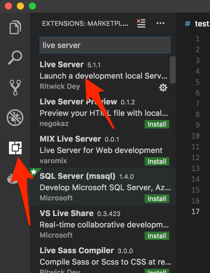
Click to install the plugin. A “reload” button should appear. Clicking this will enable us to use Live Server. You should now see a “Go Live” button appear at the bottom of the window. Clicking this will launch a browser window and serve the index file from your project root directory.
VSC comes with Emmet abbreviations already installed. These are essentially shortcuts you can use when building the structure of your HTML document. Learning these will save you time in the long run. Most other editors either support Emmet abbreviations or there is a plugin available. So, they should be useful regardless what editor you use. In this tutorial, we’ll go over some of them.
We will start with a basic HTML structure. This can be done by just using the ! bang character (or exclamation point). Simply entering a “bang”, then hitting tab will load a basic HTML5 structure. Prior to hitting tab, you’ll notice that a preview of the HTML from the Emmet abbreviation will be visible.
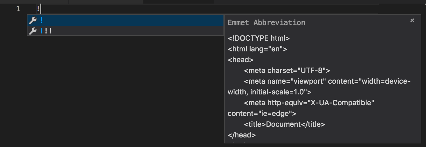
To start our tutorial, we will set up a basic HTML tag using index.html as our file name. This way, when we’re ready to load it in the browser, it will be automatic when clicking “Live Server”. Another added feature of this plugin is hot reloading. That is, it will reload automatically each time we save any changes to our file.
Now that we have our basic HTML structure, we need to come up with what HTML markup we will be needing for navigation menu. An unordered list inside of a nav element is a common way to build navigation. So, we will start with that.
To use as a starting point, let’s plan on having 5 items in our navigation bar. That is, an unordered list containing 5 list items. We can use an Emmet abbreviation to combing creating all our necessary elements.
nav>ul>li*5
The right angle bracket will nest the ul element inside the nav element, followed by 5 list items. The asterisk is used to instruct the Emmet plugin to create 5 nested li elements, as the preview below shows:
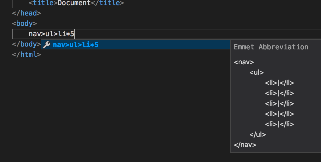 Although this is a good start, our structure is missing a couple things. For starters, we will need anchor tags inside of our list items to get the links to work properly. Second, we have no content inside our list items. Since we don’t know what the anchor text for our links will be at this point, we will use page 1, page 2, and so on. At this point, we can undo our latest change hitting
 command (or control) Z. We should now revert back to the point where we only have a basic HTML structure.
We can now use a new Emmet abbreviation to create the markup of our nav menu to better fit our needs. As before we can use nav>ul to begin our snippet. However we also need to nest an anchor tag inside each list item. This is doable using parentheses to group them together. That would leave us with nav>ul>(li>a)*5. Although this is an improvement, we still have no content inside our list items.
Since we don’t know where the links are going at this point, we will use a hash for the href attribute. We can use square brackets to add any attribute to an HTML tag: a[href=#]. Including the href attribute in each anchor tag now results in the following syntax: nav>ul>(li>a[href=#])*5. The final thing we need to do is add the anchor text of each link. The link text can be implemented using curly braces: {Page $}. The $ symbol is an incrementer which will start at 1. So, “Page 1”, followed by “Page 2”, until we reach our limit, which in this case is 5. Our final Emment snippet will be:
nav>ul>(li>a[href=#]{Page $})*5
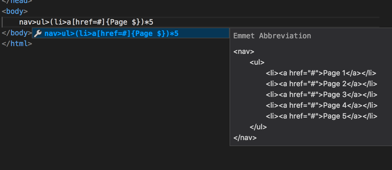 Emmet abbreviations are very powerful once you get the hang of them. It’s best to start slowly by learning a few commonly-used snippets. Eventually, you’ll be able to use more of the advanced features it offers.
At this point we can click “Go Live” at the bottom of your editor window to launch the code in our web browser. Note: I added a couple “lorem ipsum” paragraphs is filler text just after the unordered list.
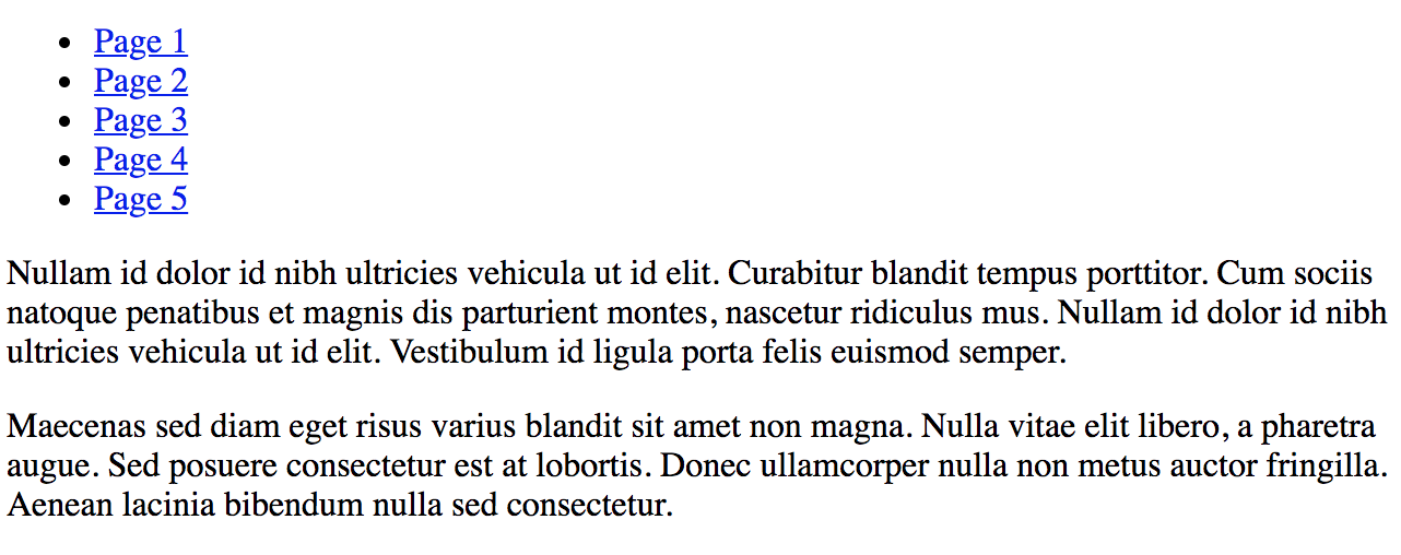 Currently, our nav menu appears to be an unordered list. This is because the browser applies default styling to any unordered lists. We have to supply CSS to reset these. In our project root, we will create a new file,
 styles.css and place it in the root folder of the project. We also need to add a link tag just before the closing head tag to include the styles we’ll be adding. The Emmet abbreviation for this is:
link[href={./styles.css}]
Which will produce:
<link rel="stylesheet" href="./styles.css">
Inside our new CSS file, the first CSS we will add will be to remove default styling:
body {
    margin: 0;
}

main {
    margin: 0.5em;
}

nav ul {
    list-style: none;
    margin: 0;
    padding: 0;
}

nav ul li {
    display: inline-block;
    padding: 1em;
}

nav ul li a {
    text-decoration: none;
}
Above: The default margin for the body tag has been removed. Without this, there will be a gap between the nav element and the top of the page. Since this is a top-level global nav, we want the menu to be fixed to the top of the page. However, we want some margin between our nav element and where the main content starts. Our “lorem ipsum” paragraphs have been nested in a main element, which we applied the margin.
Inside the ul tags, setting the list-style property to none will remove the bullet points. Inside the li tags, setting the display property to inline-block will move the list items to being displayed on a single line as long as we don’t have so many items that they exceed the width of the page.
We also need to apply some padding to keep our menu items from appearing to be smashed together. Finally, in the a tag, we need to remove the default text-decoration property, which is set to underline by default in the browser.
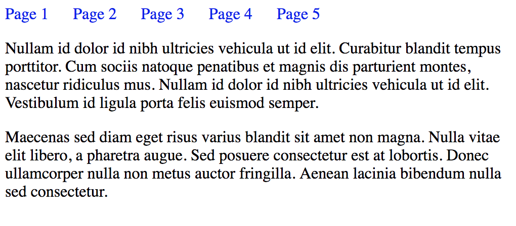 With the default styling gone, we are on the path to having something that looks like a navigation menu. In the next step, we can set some colors for backgrounds and text.
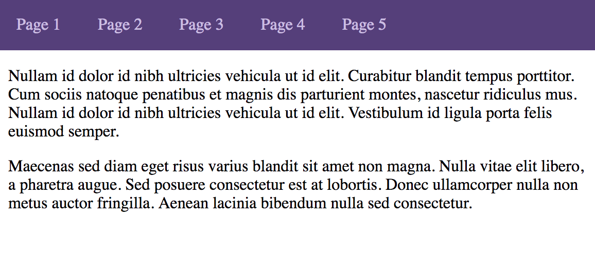
We will go with something similar to Bootstrap website. We can add the background color style to our nav element, and our text color to our anchor tag:
...
nav {
    background-color: #563d7c;
}
...
nav ul li a {
    text-decoration: none;
    color: #cbbde2
}
At this point, the colors are set. This is a massive improvement:
 Next, it would be nice to know from looking the menu what page we’re on (which page is currently active). We can do this using a CSS class. How this changes when the user navigates from one page to the next depends on the application. For server-side rendered pages, this can be done using whatever server-side templating engine is being used. If it’s a “SPA” or Single Page App, some type of event handler can be used. In this tutorial, we will add a CSS class of “active” and set it manually.
In this example, we will pretend that “Page 3” is the active page. Applying the active class would change the markup to this:
<ul>
    <li><a href="#">Page 1</a></li>
    <li><a href="#">Page 2</a></li>
    <li><a href="#" class="active">Page 3</a></li>
    <li><a href="#">Page 4</a></li>
    <li><a href="#">Page 5</a></li>
</ul>
The next step entails adding a CSS rule:
nav ul li a.active {
    text-decoration: none;
    color: #e1e1e1;
    font-weight: bold;
}
We want the active page to stand out by being a brighter color and having a heavier font-weight.
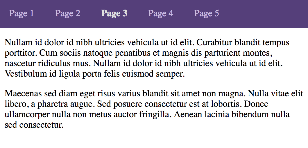 In addition to the active page, we can also use the same color when hovering over each inactive link:
nav ul li a:hover {
    color: #e1e1e1;
}
At this point, we have a menu bar that looks ok, provided we don’t add too many pages. It would be better if the top level links could support dropdowns. With this added functionality, we could click a top-level link and all the related pages of our site would be grouped together. As our site gets more complex, this will almost become a necessity. So, let’s add this feature in now.
The HTML structure will consist of a nested unordered list. We will use “Page 2” as our dropdown. The remaining top-level nav links will remain the same for now. The Emmet abbreviation of our markup will be as follows:
ul.dropdown-list>(li>a[href=#]{item $})*3
Above: we will create an unordered list with the class of “dropdown-list” which will contain 3 list items with anchor tags. The text of each element will be item 1, item 2, etc. Our markup should appear as follows:
<li class="dropdown">
    <a href="#" class="show-dropdown">Page 2</a>
    <ul class="dropdown-list">
        <li><a href="#">item 1</a></li>
        <li><a href="#">item 2</a></li>
        <li><a href="#">item 3</a></li>
    </ul>
</li>
Above: we added a couple additional CSS classes (dropdown in our parent list item, show-dropdown in our anchor tag) to our existing code. This will make it easier to work with click handlers, querying the DOM, and adding CSS.
Since we don’t want our drop-down list displayed until after “Page 2” is clicked, we need to add some CSS to hide it. While we’re at it, we can set the position to absolute positioning. This will prevent it from pushing everything else down, which would happen if it were to be visible in its normal position. We also need to set our background color to match the rest of our navigation menu. The last CSS property we will add initially is a width. Since we’re using relative units of measure, we will use 10em as our width. The default font size is 16px for most desktop browsers, so 160px will be our approximate with.
.dropdown-list {
    display: none;
    position: absolute;
    background-color: #563d7c;
    width: 10em;
}
Next, we will need to add some JavaScript to setup a click handler. In the root of our project folder, we will create a new menu.js file. We will start with an IIFE (immediately invoked function expression). Note: we will be using ES6 syntax.
(() => {
    // code will go here
})();
Be sure to add your script tag to your main html file:
	<script src="./menu.js"></script>
</body>
</html>
Inside our script, we will use a variable to get the anchor tags connected with our dropdown menus. This is very easy since we added the show-dropdown class to our elements.
(() => {
    var dropdowns = document.getElementsByClassName('show-dropdown');

    // TODO setup event listeners
})();
Above: using the getElementsByClassName method will return us a HTML Collection. We can then convert this to an array and iterate using a for-each method:
(() => {
    var dropdowns = document.getElementsByClassName('show-dropdown');

    Array.from(dropdowns).forEach((ul) => {
        var dropdown = ul.parentElement;

        ul.addEventListener('click', (e) => {
            e.preventDefault();
            dropdown.classList.toggle('open');
        });
    });
})();
We will toggle the open class to our parent element. This is very handy because it saves of the trouble of having to keep track if the class is present or not. The toggle method will add it if it isn’t there, and remove it if it is.
Finally, we need to add a little more CSS. If you recall, we initially set the display property to none for our dropdown list because we didn’t want it to be visible until the top-level menu item was clicked. We will update the display to block if the parent list item (with the class of dropdown if it also has the class open). This will force the dropdown list items to display from top to bottom.
.dropdown.open .dropdown-list, .dropdown-list li {
    display: block;
}
We are now ready to view our page in the browser to check if it’s working properly:
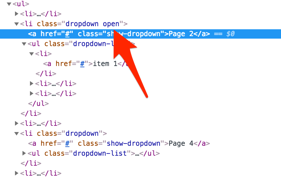
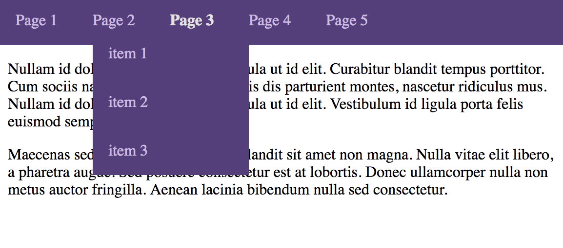 We can also right-click, and select “Inspect Element” to see if our
 open class got added properly to our parent list item:
So, thus far we have put in functional dropdowns. What we’re missing, however, is animation. A sensible animation in this case would entail a slidedown effect when the user clicks the top-level navigation item.
As far as the current implementation goes, we are using CSS to initially set the display to none for our nested dropdown list. When the top-level anchor tag is clicked, we switch the switch the display property from none to block. The first adjustment we need to make is to remove this property, and switch to using the height property. Unfortunately, we won’t be able to accomplish the full effect by just using CSS, so some JavaScript will need to be added as well.
We will start with some CSS changes:
.dropdown-list {
    position: absolute;
    background-color: #563d7c;
    width: 10em;
    height: 0;
    overflow: hidden;
    transition: height 0.3s ease-out;
}

.dropdown-list > li + li > a {
    border-top: 0;
}

.dropdown-list li a {
    display: block;
    padding: 0.5em 1em;
}
In our ul tag with the class of “dropdown-list”, we will set an initial height of 0 (previously used the display property set to none). We also gave each item in the dropdown list some padding so it’s not so close to the left edge. In addition, there were some cases depending on the anchor text where an item in the dropdown list didn’t fall to the next line. The last thing we did was remove the CSS selector setting the display to block when the dropdown list was showing.
The next change we need to apply will be to our JavaScript. It would be easy and convenient to use jQuery’s methods to query the DOM and make any needed changes to the elements. However, it would be nice to get this working whether or not jQuery is available.
Currently, we’re querying all our anchor tags with the class show-dropdown. Since our height is set to 0, we need to use the scrollHeight property of our dropdown list to set the new height value. Once we toggle the open class, we can see whether or not it’s set, then set the new height property accordingly. If the dropdown is supposed to be showing, we can set the height to the scroll height. Alternatively, if it isn’t supposed to be showing, we can set it back to 0.
(() => {
    var dropdowns = document.getElementsByClassName('show-dropdown');

    Array.from(dropdowns).forEach((ul) => {
        var dropdown = ul.parentElement;
        var dropdownList = ul.nextElementSibling;
        var height = dropdownList.scrollHeight;

        ul.addEventListener('click', (e) => {
            e.preventDefault();
            dropdown.classList.toggle('open');

            if (dropdown.classList.contains('open')) {
                dropdownList.style.setProperty('height', height + 'px');
            } else {
                dropdownList.style.setProperty('height', '0');
            }
        });
    });
})();
In the CSS listed above, recall we added a transition property:
...
.dropdown-list {
    ...
    transition: height 0.3s ease-out;
}
...
Each time the height property changes, the transition will implement a sliding effect. The duration will be 0.3 seconds with an ease-out easing method. This will give the animation an effect where the animation will slow down slightly towards the end of the animation. At this point, our dropdown lists now have a nice sliding animation to them.
Posted in motion design, javascript