Planning CSS Measurements for a New Project
The idea behind this post is to have a blueprint for setting up CSS from scratch in terms of sizing. If you’re using one of the popular UI frameworks like Bootstrap 4, this may already be set for you.
This post will consist of general guidelines. Your own project may consist of an edge case in which you’d structure your CSS differently (such as a page containing a full-screen background).
When planning CSS for a new project, there’s several things to consider. These include maintenance, code reuse, responsive design, and accessibility.
Ease of Maintenance
Making small changes like resizing something shouldn’t break the layout. Also, it’s best to design your CSS in a manner that avoids redundant code. This way, you’ll only need to update something in one place.
User’s Size Preferences
Users can change the default browser font size. To maintain flexibility, relative units of measure should be used throughout your site. If structured properly, sizes should be able to increase and decrease proportionally to what the user has set.
Prior to responsive web design, absolute units of measure, particularly pixels, were common. However, this has some limitations. If the user changes his/her default font size, it will not work effectively because a specific pixel size will override this setting.
One popular pattern was setting a fixed font size in pixels for a root element, then using em for everything else. This also has limits on being flexible because browsers on different devices have different default sizes. For example, a mobile device can have a smaller default font size than desktop. Also, as mentioned in the previous paragraph, it will still override the user’s default size as well if it’s set in pixels.
Implementing the Root Font Size
Setting the root font size using rem is the most flexible solution. In the snippet below, 0.875rem will be 14px for most default browsers.
:root {
  font-size: 0.875rem;
}
We can check the actual size the browser is rendering in Google Chrome using Chrome Developer Tools. Opening developer tools is as simple as right-clicking any html element on the page and choosing “Inspect”.

Above: checking the “Computed” tab allows us to see CSS properties as they’re actually being rendered. In the first tab, “styles”, it will display the CSS rules based on how we’ve written them. We can see in this example that the computed font size is 14 pixels.
As stated earlier, what’s important with setting the default font size using rem is that the computed size will change if if the user changes his/her browser font size setting.
To change the font size setting in Chrome, go to: Settings --> Appearance --> Font Size. “Medium (recommended)” is the default.
Next, we’re going to change this setting to see how it will effect our properties using relative measurements.

Now, we can return to the main browser window that had our original html document loaded and inspect the new computed font size:
 This was accomplished without making any changes in our stylesheet.
Notice that the only thing we’ve set so far is the root font size. In the html document, you can see from the screenshots that we have some heading tags in addition to paragraph tags. The heading tags are using the browser’s default stylesheet. After changing the font size in settings, the size of the heading tags increased in direct proportion to the root font size. Why did this happen? Because the sizes for the heading are expressed in em.
As a general principle, we want the root font size expressed in rem and everything else expressed in em.

em and rem work as multiplier. That is, the computed font size for the h3 tag above will be 24.57 pixels (21px * 1.17). So, 2em will be 2 times the current font size. This approach will also work for various html components. Things like borders will be kept in proportion to the font size.
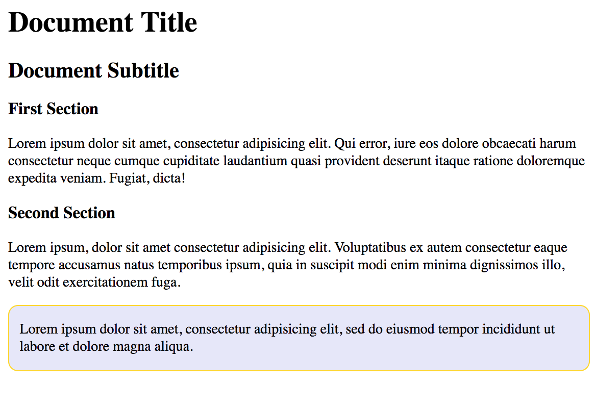
In this next example, we’ll add a very simple component. We’ll create a box with a paragraph in it and give it a border. For this box, we will require that everything scales with the font size. Our html will be as follows:
<div id="box">
  <p>Lorem ipsum dolor sit amet, consectetur adipisicing elit, sed do eiusmod tempor incididunt ut labore et dolore magna aliqua.</p>
</div>
For our CSS, our properties for border width, border radius, and padding will be set using em.
#box {
  background-color: lavender;
  border: 0.1em solid gold;
  padding: 0 0.7em;
  border-radius: 0.7em;
}
To get the output sizes we want, a little math is necessary. Since our root font size is 0.875rem (14 pixels), setting a border width to 0.1em will compute 1.4 pixels if the user is using the default font size. Alternatively, setting the left and right padding along with the border radius to 0.7em will be close to a 10-pixel target (the actual math computes to 9.8 pixels). All these properties will scale in proportion to the root font size. Our updated webpage will appear as follows:
Before we wrap up, you’ll eventually run into things that don’t exactly scale in proportion to font sizes. For example, you may have images that can only render so big without appearing pixelated. Thus, some adjustments and deviations from this approach will be necessary. Alternatively, You may have a certain situation where there is margin or padding among certain elements with different font sizes and are trying to line everything up accordingly.
In a nutshell, the pattern that has been outlined here is rem for the root font size, and em for everything else. This is a flexible solution because it will allow us to keep everything in proportion when resizing. In addition, this will allow for scaling sizes up and down easily without degrading the overall appearance of the page.
Posted in css